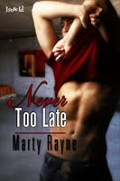
Take a look at these covers.

Why, Why, Zed? and By the Chimney with Dare are both M/M erotic works, the former published about a year before the latter. The former is part of a special line with Phaze Books, the latter a holiday story. One cover has no people on it, the other does.
The Christmas short sold exceedingly well, the Toronto story not so much. Looking at sales of my other M/M where at least one male body graces cover, I see high numbers as well. Naturally, I'm curious to know if sales had been effected by the lack of a warm (okay, nekkid) body on YYZ.
I've always been one to welcome feedback from readers; I do occasionally get mail and am happy to respond. Now, though, I'm interested in general manlove reader feedback. Even if the description and categories clearly label the book as M/M, do you hold off on buying when you don't see a bod? If there are bodies, should they be clothed, au naturel, what? With recent cover art flaps making the rounds of blogs and social media, I'm curious to know what readers think.


6 comments:
Well, for me, I like to have guys on the cover. Naked or clothed, I don't mind, but I like them there. Because then it's obvious that it's an m/m romance, and I don't have to click in on the book itself to figure it out. *lol*
A book without two (or several) guys on the cover can be anything. It can have females in it. *horror* So yeah, I like the guys on there to establish that it's a gay romance.
i agree with tt. i prefer the covers with people on the front as well. not only does it let me know that yes it is a m/m story but it lets you connect in a small way with the characters. lyne
When I'm trolling or books (as opposed to searching for a specific book I know as been released) there are two aspects:
Authors I know: I know it's going to be m/m and I likely have an idea of whether I'll like it or not, but as I'm scrolling down a list or through thumbnails, if I see a name I recognize I'll look at the blurb and make the decision. Cover? Whatever. Nice is good, but if I want it the cover means nothing.
Authors I don't know: If I'm scrolling down and see a cover with two boys on it, I'm more likely to stop because I'm assuming it's m/m. An example of your first one would not tell me anything about the genre except for the Toronto theme. I do know you write m/m but if I didn't recognize your name I'd likely flip past the book.
So a cover can tell me something about a book that will get me to click the blurb and see if it's my cup of tea. Putting a girl on the cover, even if she's not one of the protags will likely have me skimming by without stopping. Not because it's ugly or cause I like exclusively nekkid boys, but because it's telling me about the content.
Aesthetically I love books that are different and don't necessarily have shirtless bodies or other romance staples, but whether those bring in more or fewer sales I can't say. I've never not bought a book because of an ugly cover but if faced with 30 thumbnail pics of books, especially of authors I don't know, I'll likely skip over the ugly ones. Unfair though that is.
Dang, Tam's so eloquent today! Covers with people do provide a cue - if there's two guys, I'm reasonably sure I'm getting m/m. If I see additional people on the cover, be they male or female, I'm probably not even going to look at what the book is about, since I'm not reading m/f or menage.
I do find covers and cover art fascinating - especially when stock photos get overused. I have an ongoing series on my blog about that.
I'm pretty much the same as Tam and Chris on this one.
If the publisher is one where all the books are m/m then I don't need to have a couple of men on the front - and in fact pubs like TQ sometimes don't have men on the covers.
If the pub is one which does a mix of m/m and m/f books then I usually look for two men on the cover to clue me in that it's a m/m - unless I know the author is one who writes exclusively m/m books. They don't have to be naked, in fact I'm generally bored of the headless naked torso look on covers.
I'm sorry to say that I would probably have passed over the cover of the first book as it didn't give me any indication of the content or the genre. If I had to click on it to get to a blurb or extra information then I'm not sure I would have done that. There's so much competition for m/m authors that a cover which grabs your attention really is necessary for getting the readers to make that extra click to find out what the book is about.
Covers are more likely to keep me from buying a book than encourage me to buy it! If a book has a cheesy cover, I tend to get a negative opinion, even if I know and love the author. It won't keep me from buying an author I love, but it definitely makes a bad impression.
A cover with two gorgeous male bodies is a double investment--a good book and a work of art. I much prefer covers with art. ;>)
Post a Comment